CEA Study Abroad: Capabilities Brochure Series
Print / branding / art direction / infographics
With 23 destinations across 13 countries, CEA Study Abroad offers a balance of internships, academics, and adventure to more than 4,000 students each year by transforming the world into a classroom.
Recognizing the key role study abroad plays in employable graduates, CEA Study Abroad needed collateral brochures that focused on their collaboration and partnerships with universities and their teams with the purpose of advancing the future of study abroad.
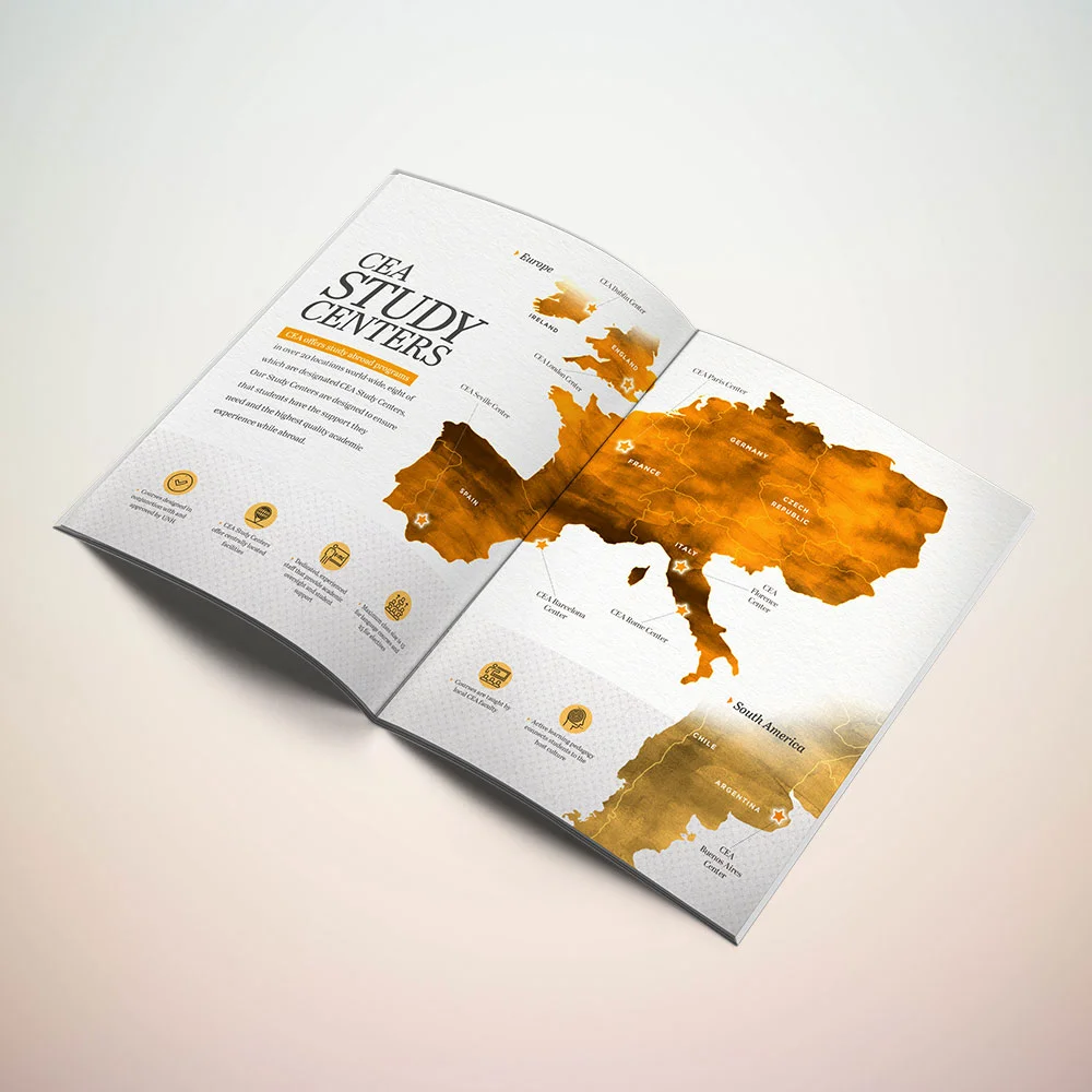
As lead Art Director and Senior Graphic Designer on CEA’s marketing team, my challenge was to create a series of three corporate brochures that would highlight their commitment to working with their university partners in three main areas — Communication, Engineering, and Business — while reflecting CEA’s academically robust, rigorous, and engaging study abroad and internship experiences through a visually appealing and infographic style.
Mood Boards + Concept Sketches: Creating the design direction
Establishing the visual representation, through mood boards and loose sketches, for each of the three brochures gave the marketing and leadership team an idea of what the finished series would look like — allowing everyone involved to get on the same page plus agree on the visual direction and layout and to avoid any misunderstandings before too much of the finished work was done.
Crafting the right visuals
Managing the design from concept to completion, my primary objective focused around crafting the right graphics which would clearly communicate CEA Study Abroad’s services — while still being aware of the high level of visual perception generated from the university partners.
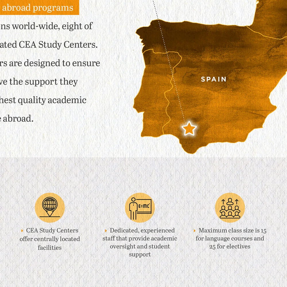
Choosing one unifying style allowed the visual theme to pull together uniformly across all three brochures. Infographics enhanced CEA’s messaging along with the use of black and white imagery, simple line iconography, and bold use of color. Simple and svelte fonts and type treatments complemented a serif body font — reinforcing the emphasis on CEA’s trustworthiness and credibility.
COLOR SYMBOLISM:
Perfect for business, Red is an attention-getting color that creates excitement and energy.
Orange creates a very stimulating and cheerful effect — perfect for communicating the friendly optimism and confidence of the engineering program.
A traditional corporate color, Blue communicates dependability and professionalism and reinforces trustworthiness.
next project
Arizona Weddings Magazine


